What is Glasmorphism and why devs are so excited about this?
Text over complex backgrounds is hard to read
Have you ever noticed that when you place text over an image with a complex background, the sharp parts of the image make the text hard to read and confusing?
Examples of text over images:


For sure, you may be able to read what it says, but the experience isn't smooth at all, it requires time from you to read the content
If you would like to see a code sample of glasmorphism, you can see a sample in this pen here.
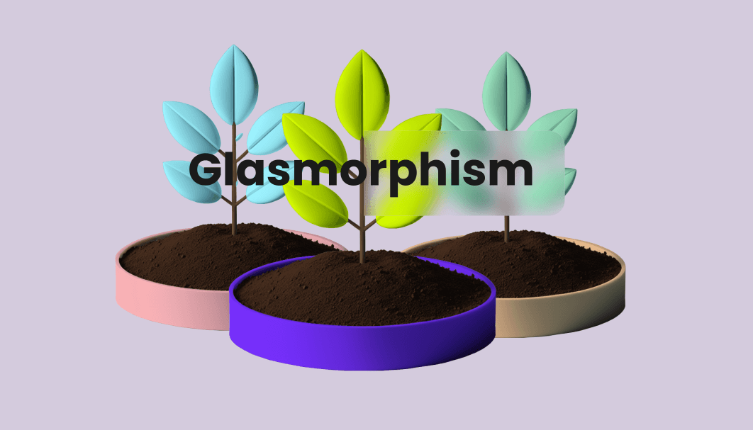
Now, glasmorphism refers in simple words, to add blur to the background where UI elements are displayed, keeping in mind the images above, with glasmorphism, this is how they would look.
With glasmorphism:
Easier to read now, isn't?
Now you don't need to put your glasses on for this one, right? Now, the words “Real State” are one of the main focus of the overall image. You may have noticed that the blur has a subtle yellow-green overlay.
Way better, isn't it?
Now, the words “INDIGO COFFEE HOUSE” are not obscured by the sharp edges or very dark parts of the image below. You may have noticed that in also has a slightly purple overlay on the blur area.
Advantages of using glasmorphism:
- Makes text more accessible
- Visually appealing
- As is becoming a trend, is becoming more familiar
How to replicate it:
- 1Choose a background where you want to display a UI
- 2Select the area
- 3Add a background blur property
What you want to avoid:
You will not want to use this everywhere, unless you want to make people visit their oculist because they are starting to believe their sight is getting worse. Use it when it adds cohesiveness to the design and makes the experience pleasant.
When to use it:
When you need to provide better contrast, this is a great approach; in overlays or modals where it makes the user focus on the content; In navigation menus where this method will make it more appealing to the users.
Leaving, glasmorphism aside for a moment. Have you heard of a visual effect called magnetism? You can see a great sample of it in the video. Is this something you would do? Check the live preview with the link below.
There is an interesting article about Nielsen Norma Group (not sponsoring), that describes in detail about glasmorphism, you may want to read it.
Is it too much bother? Remember:
“When you make minor permutations (choices) that deviate from your initial conditions, profound effects transpire over time.”
